Floral Design Principles
Before the practical side, it helps to know the core design principles professional florists work to. These are the foundation of a balanced, visually appealing arrangement.
Balance and proportion
Balance is the distribution of visual weight. A well-balanced arrangement feels stable, with no single area overwhelming the others. There are three kinds.
SymmetricalMirror images either side of a central axis, formal and traditional, right for weddings and formal events
AsymmetricalDifferent elements on each side carrying equal visual weight, more dynamic and contemporary
RadialElements radiating from a central point, which is what a round bouquet or centerpiece does
Proportion is the size relationship between the parts. A good rule of thumb is that the arrangement should stand one and a half to two times the height of its container. The flowers should vary in size too, with larger blooms as focal points and smaller ones as fillers.
Color harmony
Color is the most powerful tool in floral design. Understanding what colors mean, and how they work together, is how an arrangement ends up suiting the occasion rather than fighting it. The guide to flower color
meanings covers what each one says.
MonochromaticDifferent shades of one color, elegant and sophisticated
AnalogousColors next to each other on the wheel, like yellow, orange and red, harmonious and natural looking
ComplementaryOpposites on the wheel, like purple and yellow, vibrant and high contrast
TriadicThree colors equally spaced on the wheel, balanced and colorful
Focal point, dominance and rhythm
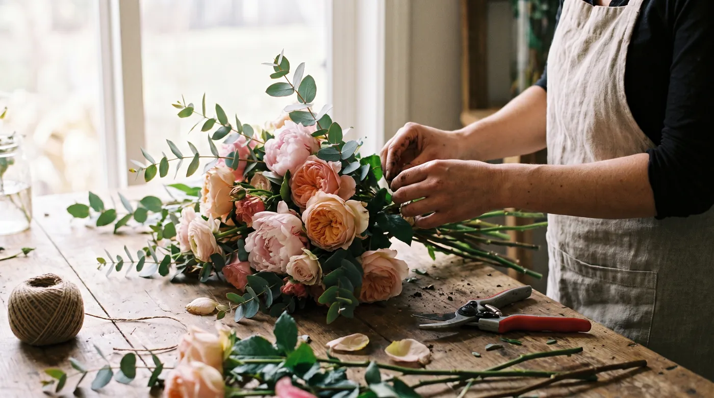
Every arrangement needs a focal point, the area the eye goes to first. It is usually made with larger, more vibrant or unusually shaped flowers. Roses, peonies and sunflowers make excellent focal flowers because of their size and impact.
Dominance is what stops an arrangement descending into visual chaos: one element has to lead. That can be color dominance, with one color more prevalent, size dominance, with larger flowers commanding attention, or texture dominance.
Rhythm guides the eye through the arrangement, and it comes from repeating colors, shapes or textures across the design. Movement is what gives it flow and life instead of looking static.